
An early build of Microsoft’s Windows 11 update has just leaked onto the internet, and we’ve been covering all the tidbits we can find in it. As we continue to update our coverage with bits and pieces of the overall update, we learned that there was something else worth exploring. We long thought that Windows 11 would borrow some design cues from the now-defunct Windows 10X, but we never had any solid evidence. Now that we have a Windows 11 build to play around with, we can finally compare the new OS to the leaked builds we saw of Windows 10X. Without further ado, let’s dive right in.
Setup experience
Windows 11 is still very similar to Windows 10 at the end of the day, but there is definitely some influence from Windows 10X. The first thing you’ll notice is the new setup experience, or OOBE. When setting up a Windows 11 machine, the process is a lot more visual, with imagery accompanying every step. In the images below, you can see Windows 10X on the left and two Windows 11 images on the right. The Windows 10X screenshots in this article were grabbed from this video by Neowin.

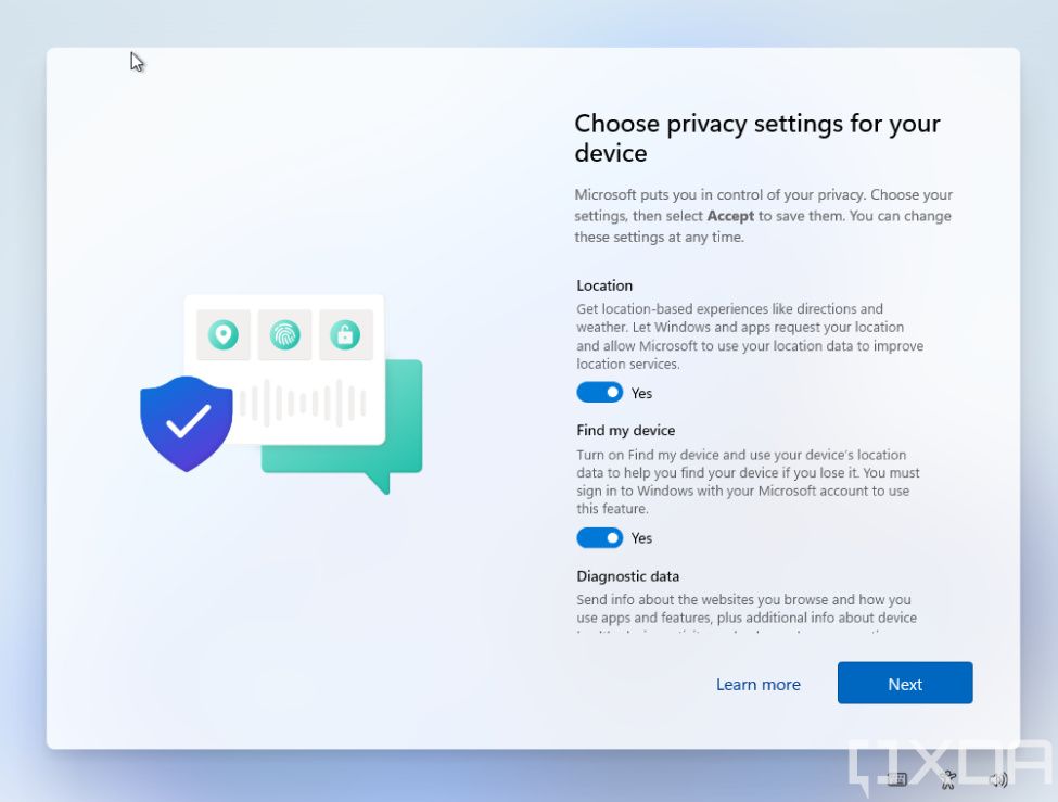
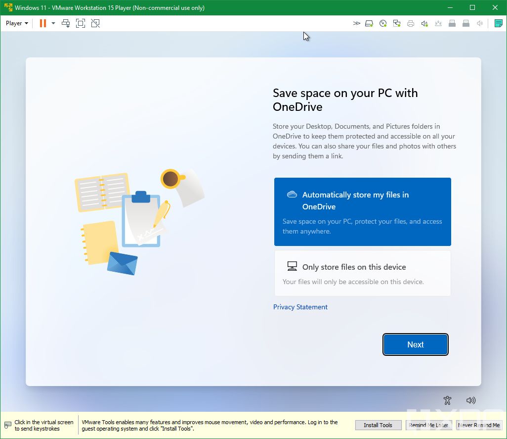
In Windows 10, everything was much more text-based, but the Windows 10X experience is very similar to what we’re seeing today. You’ll probably only see this once, but it’s nice to see such a dramatic improvement. It’s not a simple port of the Windows 10X experience, though. The icons there used more contrasting colors, while in Windows 11, we’re seeing mostly cool shades closer to the typical blue of the Windows logo. Some parts of the experience do use the more colorful look, though. The buttons have also been tweaked and made even rounder.
Start menu
The biggest design influence that Windows 10X seems to have had on Windows 11 is the new Start menu. Microsoft is doing away with Live Tiles and using static app icons for the most part, and that’s something we’ve been hearing about for a while. Windows 10X brought us our first glimpse at what that looks like, and Windows 11 uses it too. At the top of the Start menu, you’ll see a list of pinned or recently-used apps, with recommended documents and folders listed below. You can also see that the Start menu icon — and all the taskbar icons, in fact — are centered. However, in Windows 11, you can actually choose where you want them to be aligned.

Again, it’s not an exact copy. In Windows 10X, the user and power menus had been moved to the Action center. In Windows 11, you can still find them at the bottom of the Start menu.
Rounded corners
Finally, one thing that’s probably a bit more subtle, but very welcome, is the addition of rounded corners. Windows 10X had them almost everywhere, and while that doesn’t seem to be the case here yet, we see them in a few places already, like the Action center.

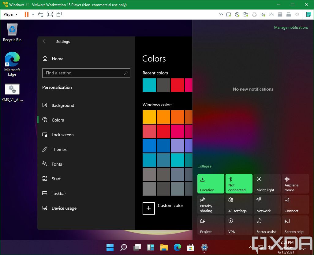
Unfortunately, the rounded corners are the only thing that the Windows 11 Action center seems to have borrowed from Windows 10X right now. The radically different design for the flyout didn’t make it over, and volume controls are still not included in the quick actions.
What didn’t make it over
There are actually quite a few things that didn’t make it from Windows 10X to Windows 11, though. After all, Windows 10X was a very stripped-down version of Windows that had to be reimagined in a few ways. It had new File Explorer and OneDrive apps, for example. Windows 11 will keep things familiar, using the same design for the apps that we already know. There are some new icons for File Explorer, but those were already in Windows 10 if you’re an Insider in the Dev channel.
There have also been a few iconography changes with Windows 11. There’s a new Windows logo that’s more square instead of the skewed perspective we’ve been seeing since Windows 8, a new task view icon, and a new search button. Obviously, you’re also not forced to open every app in full screen, which wouldn’t sit well with typical Windows 10 users. Similarly, Win32 apps are still supported in Windows 11, whereas Windows 10X would have focused solely on UWP. Remember, that was going to be aimed at cheaper devices before it was canceled. Windows 11, on the other hand, is for every Windows user, even those still on older versions.
Additionally, it’s important to note that what we have isn’t the final build, so we could see more changes before the first public release. In fact, we don’t know for sure how this build compares to what Microsoft will show us on June 24. This could be an outdated build and we could still be in for a surprise. Regardless, we’re going to keep digging into today’s leaked build and finding any other big changes you can look forward to.
The post Windows 11 takes some obvious design cues from Microsoft’s canceled Windows 10X appeared first on xda-developers.
from xda-developers https://ift.tt/3gqrM7c
via IFTTT
No comments:
Post a Comment