
As the price of ultra-premium smartphones continues to rise, what are companies doing to distinguish their displays from the rest? Are there still areas that they can improve on without needing to adapt new display hardware?
These are questions that become more uncertain as the quality of display panels inevitably increases across the entire price spectrum. In an effort to address the first question, OnePlus includes a collection of somewhat unique features in its flagship OnePlus 9 Pro device, such as video motion interpolation, automatic display white balance, and SDR-to-HDR video conversion. Although my two opening questions are directly related, I maintain that the best way to satisfy the first question is by focusing on the second question—new hardware naturally comes to every company, but not every company makes good use of new hardware. How does the OnePlus 9 Pro fare?
The OnePlus 9 Pro unit used for this review was loaned to us by OnePlus. However, OnePlus did not provide any input or compensation for this review.
Display Review Highlights
- Excellent peak brightness and sunlight legibility
- Outstanding sRGB and P3 color accuracy in calibrated color modes
- Accurate D65 white point in calibrated color modes
- Very good grayscale precision
- Poor shadow details at low brightness levels
- Does not get very dim at minimum brightness
Table of Contents
OnePlus 9 Pro Display Specifications
OnePlus continues to source high-end OLEDs from Samsung Display for its flagship. The OnePlus 9 Pro bestows a large, super-sharp 6.7-inch front panel with 525 pixels per inch, and it supports a 120 Hz refresh rate for smoother motion and interaction with the phone. It is very similar in specs to last year’s flagship model, but the OnePlus 9 Pro is in fact using updated display internals. A new set of luminescent materials with enhanced emissive efficacy is being used for the OLED, and a new display backplane technology called LTPO is incorporated to further improve the power efficiency of the display. And finally, the display driver IC of the OnePlus 9 Pro now natively supports 10-bit color depth instead of resorting to 8-bit + 2-bit FRC. If these specs seem familiar, it’s because the panel that OnePlus uses is actually identical to what OPPO uses in the Find X3 Pro.
The new hybrid backplane utilizes IGZO driving transistors which require less power than conventional LTPS transistors to output the same amount of light. In addition, IGZO transistors have significantly lower off-leakage current than LTPS transistors, which makes them more suitable for driving display panels at lower refresh rates since they can hold their charge longer. The oxide transistor is the catalyst for a viable true hardware-level variable refresh rate, and it means that the OnePlus 9 Pro’s high refresh rate panel should be much less battery-taxing than its predecessor.

Panel uniformity at 0.01 nits
Subpixel arrangement
All of Samsung Display’s smartphone OLED panels utilize a PenTile diamond subpixel arrangement, including the one on the OnePlus 9 Pro. I thought it would be interesting to compare OnePlus’ subpixel layout to a couple of other flagship OLEDs, and by doing so, we can see clear differences in subpixel proportions; the iPhone 12 Pro Max’s OLED panel has relatively much larger subpixels than both the OLED panels in the OnePlus 9 Pro and the Samsung Galaxy Note20 Ultra, especially with respect to blue subpixels.
It’s been purported that the OLEDs in iPhones have greater pixel fill factors (the proportion of the total pixel area that is actually emissive, also known as aperture ratio), and we now have verification of this. Using microscope photos (taken by the OPPO Find X3 Pro) as reference, I’ve coarsely calculated the iPhone 12 Pro Max to have a fill factor of approximately 35-40%, while a typical Samsung Display OLED measures only about 25–30%.
The main advantage of a higher pixel fill factor is greater pixel longevity. Larger subpixels will last longer (assuming luminance is normalized), resulting in slower display burn-in. Another thing to note is that blue emitters in OLEDs have by far the shortest lifespan, so they degrade the fastest. This is why OLEDs typically tint towards yellow over time as the red/green/blue OLED emitters decay at different rates. In our subpixel comparison, the iPhone 12 Pro Max contains blue subpixels that are relatively about 70% larger than those of OnePlus’, and as a result, the OLED panel of the iPhone 12 Pro Max should experience burn in more slowly and exhibit less yellowing over time than a typical Samsung Display OLED.
OnePlus 9 Pro Display Features
Included in the OnePlus 9 Pro are several display features that can adjust the screen or the media content that is being played.
Motion Graphics Smoothing increases the smoothness of video content (in supported apps) by interpolating additional frames, converting video up to 60 frames per second (or 120 FPS when enabling it in the OnePlus Laboratory). This sort of feature is found in many TV sets, and while it can make motion appear smoother and clearer, some people dislike it since it can make content look like soap operas, or other times it can just look wrong. It also has the potential to render unwanted artifacts within the generated frames. From my usage of this feature on the OnePlus 9 Pro, the motion interpolation works very well in smoothing motion without significant artifacts, although the smaller screen estate of a smartphone display may just mean that artifacts are less perceptible.
Comfort tone is functionally identical to Apple’s True Tone. It adapts the white balance of the display to better match that of your viewing environment, which can help improve the consistency of the appearance of white. The adjustment range for the color temperature of white varies from 5000 K to 7400 K, and from my usage, the feature tends to shy away from tinting too warmly relative to the environment when compared to True Tone. During transitions, the shift is very seamless, so you may not be able to even perceive that the feature is doing anything at all. This means that the feature is working well. There is a controversy behind this type of feature due to the belief that it impacts color accuracy, but in actuality, the perceived colors on a screen are changing all the time whenever the surrounding light changes; features like auto brightness and auto white balance attempt to counteract some of the perceptual shifts that occur whenever the viewing environment changes. The potential utility in these features depends on if the feature itself works seamlessly, and I do think that Comfort tone works pretty well.
Hyper Touch is a setting exclusive to the OnePlus 9 Pro that increases the touch polling frequency up from 240 Hz to 360 Hz. Enabling this feature should improve touch latency, however, I was unsuccessful in detecting any difference no matter the game/application since the response time with the feature disabled is already very good. OnePlus notes that it may cause minor flicker in some scenes, but I haven’t seen that happen. Out of curiosity, I briefly tested to see if the feature improved the pixel response time for dark pixels, but alas, the same amount of ghosting/”purple smear” was present.
Vibrant Color Effect Pro increases the contrast and saturation of video content, intending to upscale the content from standard dynamic range to high dynamic range. At the time of writing, this feature seems to be ineffective since I have not been able to get it to work at all despite toggling a dozen combinations of the display settings.
Ultra-high Video Resolution is an AI upscaling feature that increases the sharpness of video content in supported apps. So far, there appear to only be three apps that are supported: WeChat, Instagram, and Snapchat.
Vision Comfort is OnePlus’ version of Night Light, which reduces the emission of blue light by making the screen warmer. However, this feature is slightly different since it can also lower the saturation of the display to make it more comfortable to look at in low light.
OnePlus collaborated with Pixelworks, a company that specializes in video and image processing, for some of these features. Inside the OnePlus 9 Pro is Pixelworks’ X5 Pro visual processor which handles the HDR upscaling (Vibrant Color Effect Pro) and the motion processing (Motion Graphics Smoothing). Two MIPI lanes feed the Pixelworks chip, which are used to send over the video stream and the Android UI surface over separate lanes. The X5 Pro processes the video stream independently and then sends a composited frame with the UI to the display. We have published a separate article that covers what else the Pixelworks chip can do. Pixelworks is also responsible for the factory color calibration of the OnePlus 9 Pro display. Some notable features that existed on the OnePlus 8 Pro seem to be missing in this year’s model, however, such as DC dimming and the Night mode Lightness slider.
Source: Pixelworks.
To learn more about the OnePlus 9 Pro’s features, read our launch coverage. For our subjective thoughts on these display features as well as other aspects of the phone, read our full review. For our data-driven analysis of the OnePlus 9 Pro’s display, read on.
Methodology for gathering data
To obtain quantitative color data from the OnePlus 9 Pro, I stage device-specific input test patterns and measure the display’s emission using an X-Rite i1Display Pro metered by an X-Rite i1Pro 2 spectrophotometer in its high-resolution 3.3nm mode. The test patterns and device settings I use are corrected for various display characteristics and potential software implementations that may alter my desired measurements. My measurements are typically done with display-related options disabled unless mentioned otherwise.
I use constant power patterns (sometimes called equal energy patterns), correlating to an average pixel level of about 42%, to measure the transfer function and grayscale precision. It’s important to measure emissive displays not only with constant average pixel level but also with constant power patterns since their output is dependent on the average display luminance. Additionally, a constant average pixel level does not inherently mean constant power; the patterns I use satisfy both. I use a higher average pixel level closer to 50% to capture a midpoint between both the lower pixel levels and the many apps and webpages with white backgrounds that are higher in pixel level.
I use the color difference metric ΔETP (ITU-R BT.2124), which is an overall better measure for color differences than ΔE00 that is used in my earlier reviews and is still currently being used in many other sites’ display reviews. Those that are still using ΔE00 for color error reporting are encouraged to use ΔEITP.
ΔEITP normally considers luminance error in its computation, since luminance is a necessary component to completely describe color. However, since the human visual system interprets chromaticity and luminance separately, I hold our test patterns at a constant luminance and do not include the luminance (I/intensity) error in our ΔEITP values. Furthermore, it is helpful to separate the two errors when assessing a display’s performance because, just like with our visual system, they pertain to different issues with the display. This way, we can more thoroughly analyze and understand the performance of a display.
Our color targets are based on the ITP color space, which is more perceptually uniform than the CIE 1976 UCS with much better hue-linearity. Our targets are spaced out roughly even throughout the ITP color space at a reference 100 cd/m2 white level, and colors at 100%, 75%, 50%, and 25% saturation. Colors are measured at 73% stimulus, which corresponds to about 50% magnitude in luminance assuming a gamma power of 2.20.
Contrast, grayscale, and color accuracy are tested throughout the display’s brightness range. The brightness increments are spaced evenly between the maximum and minimum display brightness in PQ-space. Charts and graphs are also plotted in PQ-space (if applicable) for proper representation of the actual perception of brightness.
ΔETP values are roughly 3× the magnitude of ΔE00 values for the same color difference. A measured color error ΔETP of 1.0 denotes the smallest value for a just-noticeable-difference for the measured color, and the metric assumes the most critically adapted state for the observer so as not to under-predict color errors. A color error ΔETP less than 3.0 is an acceptable level of accuracy for a reference display (suggested from ITU-R BT.2124 Annex 4.2), and a ΔETP value greater than 8.0 can be noticeable at a glance, which I’ve concluded empirically.
HDR test patterns are tested against ITU-R BT.2100 using the Perceptual Quantizer (ST 2084). HDR sRGB and P3 patterns are spaced out evenly with sRGB/P3 primaries, an HDR reference white level of 203 cd/m2 (ITU-R BT.2408), and a PQ signal level of 58% for all the color patterns. All HDR patterns are tested at 20% APL with constant power test patterns.
Color profiles


Like most other Android phones, the OnePlus 9 Pro provides two base color profiles that change the color characteristics of the screen.
The phone’s default profile is the Vivid profile, which has a slight boost in saturation and contrast with a colder white point (~7000 K) than standard. Regardless of content color space, the Vivid profile maps colors out to a gamut that is slightly larger than Display P3 in its greens and blues.
The Natural profile is the color-accurate profile that targets industry standards, which follows a 2.2 gamma power and a D65 white point. The profile targets the sRGB color space by default with support for color management to Display P3 for apps and content that support it.
There is an “Advanced” setting that allows the user to manually target the sRGB or Display P3 color space, as well as an “AMOLED Wide Gamut” setting that targets the native gamut of the OnePlus 9 Pro’s OLED display. Selecting any of these options also enables a color temperature slider that can be used to adjust the white point of the screen; an auxiliary green/magenta tint slider is also surfaced.
Display Brightness of the OnePlus 9 Pro

Peak luminance vs content APL
The OnePlus 9 Pro gets as bright as most other high-end Samsung Display OLEDs, which is typically about 800 nits peak for fullscreen white (100% APL). This is sufficient brightness for decent outdoor display legibility, and it provides a lot of usable output for HDR content. Like other Android devices, this peak brightness is only activated under very bright lighting when auto-brightness is enabled—otherwise, the peak brightness is limited to 500 nits. Samsung does make brighter OLEDs that can reach 1,000 nits @ 100% APL, but so far, they have only been used in the Galaxy Note20 Ultra, the Galaxy S21 Ultra, and the Xiaomi Mi 11 Ultra.
The Vivid profile allows lower average display luminance (ADL) levels to output brighter levels of white. This means that light-themed apps, which have higher ADL levels, will have approximately an 800-nit white level for its background, but darker apps with less content area allow for much brighter levels of white. For example, the OnePlus 9 Pro is able to get up to 1100 nits for white at 10% ADL (approximate ADL for dark-mode apps). However, this comes at the expense of darker midtones and shadows, which impacts image contrast and detail.
The Natural profile maintains an 800-nit peak white level independent of ADL. Although this means that the profile can’t output whites that are as bright as the Vivid profile in darker apps, the Natural profile has much more consistent tonal control and image contrast. As we’ll get to later on, the Natural profile actually renders midtones and shadows brighter than the Vivid profile at the display’s maximum brightness. Because of this, in many cases the Natural profile will represent content with better detail and legibility than the Vivid profile under bright lighting.
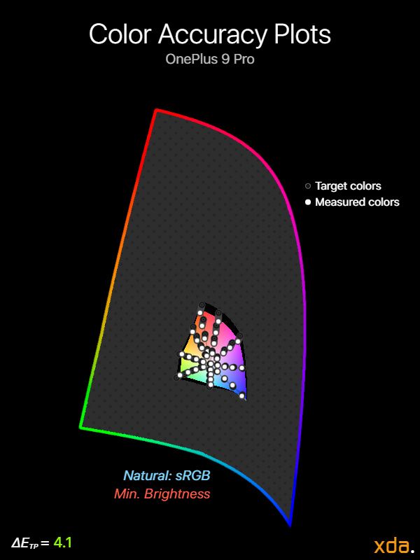
On the low end of the brightness slider, the minimum white level of the OnePlus 9 Pro can only go as low as about 2.4 nits, while most other OLED displays can get down to about 1.8–2.0 nits. And unlike some other phones, the OnePlus 9 Pro doesn’t have any features that can further reduce this brightness, which is perplexing since OnePlus’ last two flagships included such a feature (i.e. Night mode). What’s even stranger is that when Dark mode is active, the white level of the minimum brightness actually bumps up to about 3.9 nits, which can result in whites that are too bright when viewing your phone in a dark environment. My assumption is that this a hacky adjustment meant to combat some of the black clipping that occurs at minimum brightness so that dark mode UI elements don’t completely disappear. Of course, the proper way to handle this situation would be to adjust the tone curve directly so that near-black tones aren’t clipped instead of limiting the minimum white level to such a high value.
Contrast & Tone Mapping
As usual, the single most important characteristic of display quality is contrast. While OLED technology can create the deepest possible contrast due to self-emitting (self-defeatable) pixels, tonal accuracy is just as, if not more, important; tonal accuracy imposes the overall appearance of photo and video by directly accounting for image contrast and color mixtures. Unfortunately, OLED displays have been characteristically difficult to calibrate, largely in part due to their brightness fluctuating with content APL (more precisely, frame-average light level). Fortunately for us, recent flagship phones have significantly improved in this area—but still require work in others.
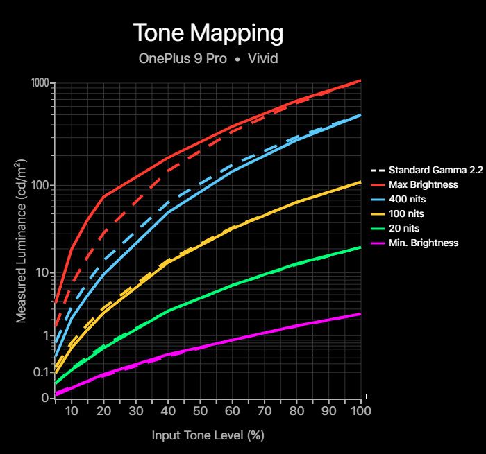

Tone mapping charts
Measured at 40% APL (~27% Target ADL)
Following standard practice, we’ll first look at the 100-nit display calibration (yellow curve) for the OnePlus 9 Pro. My measurements show that both profiles slightly undertrack the gamma-2.2 reference target (even more so on the punchier Vivid profile). The Natural profile is within the range of what can be considered accurate, however, it is tuned with slightly steeper shadows which approximate a gamma power closer to 2.30. I contend that a 2.20 gamma power is an overall better target for a phone display so that shadow details can remain legible when considering veiling screen glare. Despite the slightly darker output of the Natural profile at 100 nits, it does manage shadow details very well around this white level. However, this varies significantly depending on display brightness, which we’ll cover in a moment.
I also test the display calibration at max brightness (high brightness mode), 400 nits white level, 20 nits white level, and minimum brightness. Notice that as display brightness gets higher (ignoring max brightness), the more the Vivid profile undertracks the 2.2 gamma target. This is not the case for the Natural profile, which maintains its 2.2 gamma tracking. This is because the Vivid profile allows its brightness to fluctuate with content APL, while the Natural profile normalizes its brightness response. Controlling the OLED brightness response is necessary to maintain a precise tone mapping calibration, which the Natural profile accomplishes. On the other hand, the Vivid profile allows its whites to get marginally brighter at the expense of darker midtones and shadows.
At max brightness, the OnePlus 9 Pro significantly boosts the lightness of shadows and midtones to improve display legibility under bright light. This is a very welcome choice that I’m happy to see, and I hope to see more OEMs follow suit instead of just trying to maximize the brightness of white for lower APLs (e.g. Samsung). As we’ve covered, the Vivid profile does have slightly brighter whites since it allows it to boost at lower APLs, but as a result, the Vivid profile actually renders darker shadows and midtones than the Natural profile at max brightness. This means that the Natural profile is the more legible display profile in many cases under high brightness. However, the Vivid profile will likely result in more accurate color saturation under intense lighting since high ambient lighting results in desaturation.
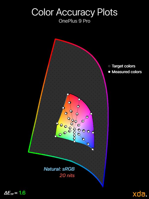
At lower brightness levels (20 nits and minimum brightness), the OnePlus 9 Pro continues to track a 2.20 gamma power, which is not an optimal tone curve target at low brightness. This is because it results in shadows that are too dark relative to the same gamma target at 100 nits. Some phones resolve this by targeting a lower gamma power at lower brightness, which reduces image contrast but improves clarity in the shadows. The good news is that these tonal calibrations are an improvement over the OnePlus 8 Pro, which had strong dips in its shadow tones that were much worse.
We too often see OLED displays that ramp up too slowly in tone luminance near black, which we might see and interpret as “black crush”. This also happens when a display’s shadow tones are so dark that the veiling glare from the lighting in your environment obscures the shadows. For example, although the Natural profile at 100 nits provides substantial near-black output down to #010101, the steeper shadows may still appear clipped depending on the environment. However, we don’t proclaim that its shadows are decidedly crushed since it requires a less-than-ideal environment to result in perceptual clipping. It is only problematic in the case when a display appears to crush near-blacks when viewed within a reasonable environment with little-to-no glare, which unfortunately happens to be the case for the OnePlus 9 Pro at low brightness (and also at 400 nits, which we’ll see in a bit).
What I’ve found is that at low brightness and at 400 nits white level, the OnePlus 9 Pro leaves a bit to be desired when it comes to shadow details. An ideal display should be able to clearly distinguish near-black colors (down to black) when little-to-no veiling glare is present, which the Natural profile is capable of at 100 nits white level. But as we move down towards lower brightness, near-black tones become darker and darker until they perceptually clip at an increasing rate. At 20 nits white level, the OnePlus 9 Pro loses tone levels below 2.7% (#070707), and at minimum brightness, this percentage moves up to 3.9% of the range that is lost. This is a moderate loss of detail at lower brightness, and it’s disappointing to see OnePlus continue to fail here especially when most of their previous phones (OnePlus 7 Pro and prior) actually performed quite well in this category. At a higher brightness level of 400 nits, the OnePlus 9 Pro is (expectedly) able to output down to #010101, but near-black color tones at this white level are much darker compared to at 100 nits. Combine this with the fact that a 400-nit display is typically viewed in brighter conditions with greater veiling screen glare, and you get perceptually crushed blacks, which we talked about earlier.
White Balance & Grayscale Precision
Regardless of the white point color temperature that you prefer, the color of white should appear consistent at every grayscale level, independent of the display brightness. The grayscale charts below plot the measured colors of white throughout the grayscale at different display brightness levels for both the Vivid and the Natural display profiles on the OnePlus 9 Pro.
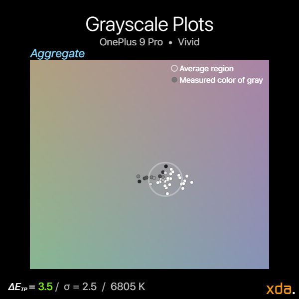

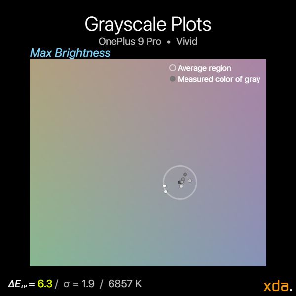

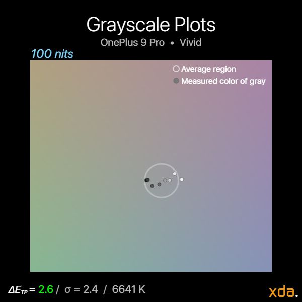
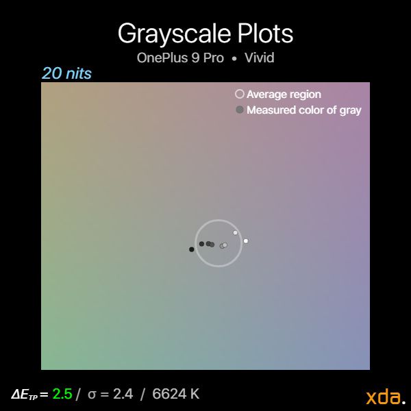

Grayscale plots for Vivid profile
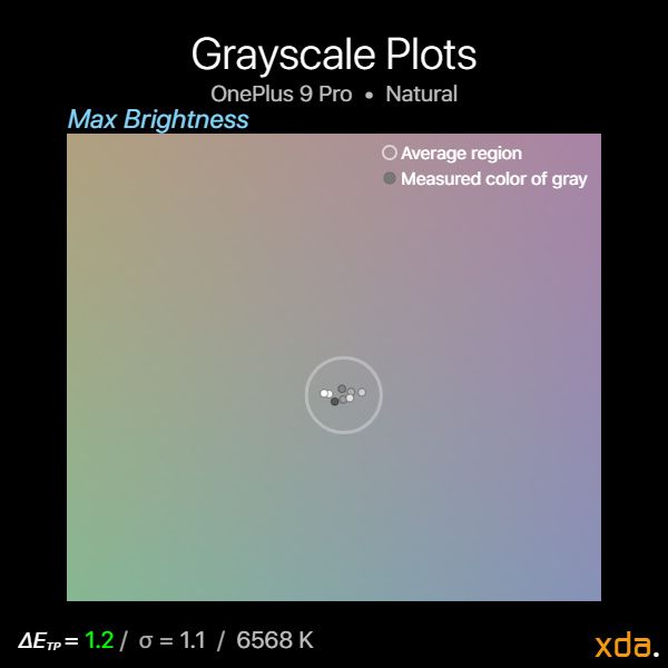


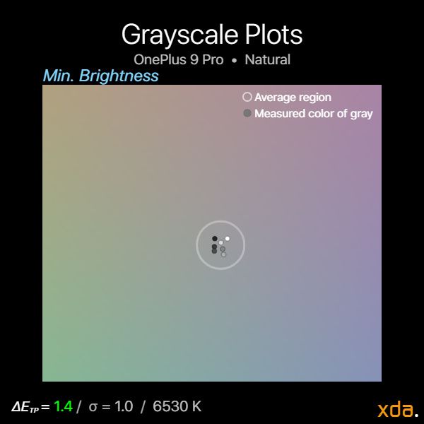
Grayscale plots for Natural profile
The calibrated white point color temperatures of the OnePlus 9 Pro remain consistent throughout the display’s brightness range, which is about 6900–7000 K for the Vivid profile and 6500–6600 K for the Natural profile. Gray tones are also fairly precise, so little-to-no tinting should be visible for any given display brightness. The severity of tinting may vary from unit to unit, although calibration trends generally remain. These measurements are huge improvements over the OnePlus 8 Pro, which showed a huge degree of color tinting, especially for dark colors at lower brightness.
Color Accuracy of the OnePlus 9 Pro


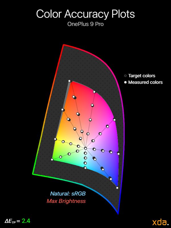

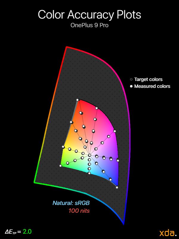
sRGB color accuracy plots for Natural profile

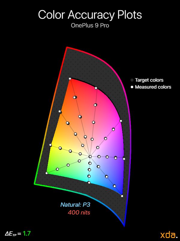
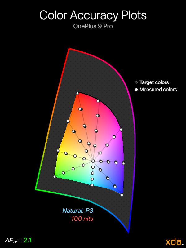


Display P3 color accuracy plots for Natural/Display P3 profile
When it comes to color accuracy, the OnePlus 9 Pro is among the best that I’ve measured for a smartphone display. The Natural profile has astoundingly low ΔETP color errors for sRGB and for Display P3, with no colors measuring a higher ΔETP value than 6.0. The exception is at minimum brightness where colors appear more muted relative to the standard 2.2 gamma (including the red primary for sRGB), although it’s very typical for displays to compress colors at brightness levels this low.
Accurate Display P3 color accuracy is good for futureproofing when P3 content becomes more abundant, but at the time of writing, P3 content is still very scarce in the Android world. Some Android phones are just now adopting support for P3 photo capture, but unfortunately, the OnePlus 9 Pro is not one of them.
One interesting characteristic of the Vivid profile is that the display will increase its saturation by expanding to the panel’s native gamut in high brightness mode; this is done to counteract some of the desaturation caused by high ambient lighting. This effect does not occur in the Natural profile, but in my opinion it should, especially when the Natural profile itself has brighter midtones and shadows than the Vivid profile.
HDR10 Playback on the OnePlus 9 Pro

Measured at 200 nits frame-average light level, 1000 nits content light level, 100% display brightness
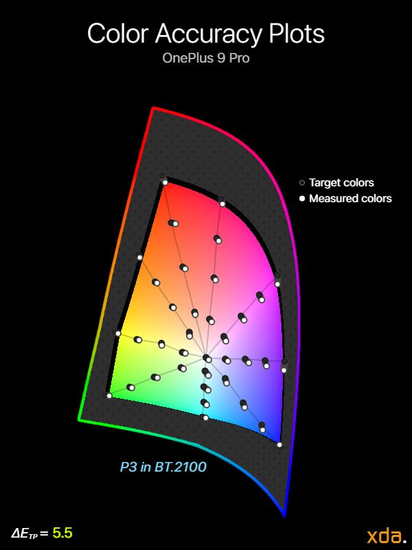
Many media streaming platforms now provide a wide catalog of HDR content in both HDR10 and Dolby Vision, and it turns out that the OLED panels on premium phones are some of the most capable displays to play them. Since the OnePlus 9 Pro does not support Dolby Vision, we’ll look exclusively at its HDR10 playback capabilities.
Most HDR10 content that is delivered through streaming services assume a maximum potential content light level (“MaxCLL”—the maximum luminance of any single pixel throughout the entire film) of 1,000 nits or lower since very few consumer displays currently surpass this specification. A brightness roll-off via tone mapping is needed when the peak brightness of a display cannot meet the MaxCLL of the content that is being played. Since the OnePlus 9 Pro is able to output over 1,000 nits at reasonable APLs, it should not need to tone map for HDR content with a MaxCLL of 1,000 nits or below, but it does. Like most other Android phones, the OnePlus 9 Pro ignores the MaxCLL for HDR content, and it seems to always roll off too early, which wastes a lot of the display’s potential output in luminance. As a result, the OnePlus 9 Pro can only output up to ~800 nits in the Vivid profile or ~600 nits in the Natural profile for HDR content with a MaxCLL of 1,000 nits or lower, when it should be able to output the full 1,000 nits. Very few titles do get up to 1,000 nits, though. Still, it’s a shame to see wasted potential.
The contrast for the rest of the range looks pretty good in the Vivid profile, with just a slight lift in the shadows and a kink in near-blacks that crushes some details in very dark scenes. The Natural profile, on the other hand, has slightly lighter midtones and even lighter shadows, resulting in lower contrast than the HDR PQ target. This is disappointing performance for what’s supposed to be the color-accurate profile, but it shows that OnePlus focused on calibrating HDR content in the Vivid profile, and it’s the profile that should be used when watching HDR content on the OnePlus 9 Pro.
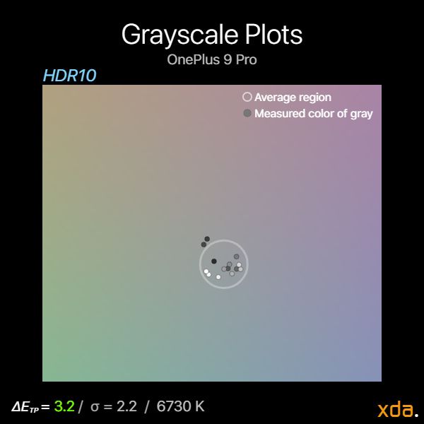
For HDR color accuracy, the OnePlus 9 Pro leans noticeably cold, measuring a color temperature of about 7000 K for diffuse white (~203 nits) and for midtone grays. Color precision is fairly good, but mid-shadows can appear warmer. The overall coolness of the calibration is very evident in the color accuracy charts, where everything is discernibly tinted towards blue.
Overall, the HDR experience on the OnePlus 9 Pro is decent. Most display sets calibrate HDR10 at maximum display brightness, but I would love to see more devices calibrate it for a lower display brightness level (e.g. at 50% like Apple) so that higher brightness levels could allow for brighter HDR setting. This would be a useful alteration since the standard HDR PQ target is meant to be viewed within a dark environment (5 nits surround), and not many people actually do so—especially not on their phones.
Conclusion
In most conditions, the OnePlus 9 Pro’s display is truly superb. Its color accuracy in the Natural profile is one of the best that I’ve measured, although lately I haven’t actually valued color accuracy as highly since most phones have been doing it really well—just as long as there aren’t any extraordinary color errors, which there aren’t in the OnePlus 9 Pro.
The white point is the color that we’re most sensitive to noticing differences in, and it’s typically calibrated too warm in the accurate profile of many OLEDs; thankfully, our OnePlus 9 Pro unit does measure an accurate D65 white point.
At medium brightness levels (~100 nits), the display demonstrates great shadow detail albeit with a slight punch in contrast. In high brightness mode, the decision to tonemap for much lighter midtones and shadows is a welcome one that allows details to be legible under sunlight, and the Vivid profile’s ability to expand to its native gamut helps with maintaining color saturation.
The high refresh rate panel is extremely smooth and works well, but I would prefer if it didn’t always ramp down to 60 FPS whenever video content is present since the user may sometimes still want to scroll around—the display panel’s improved power efficiency should be able to afford it. Features like Comfort tone and Motion Graphics Smoothing are also nice to have for those that can enjoy their utility; many of the other features, however, are rather lackluster and are not even supported in most apps.
Just from display specifications alone, it may seem easy to just say outright that the OnePlus 9 Pro has one of the best displays on the market. Unfortunately, I cannot say that this is totally true. Lower-brightness display performance is an area that many smartphone companies still seem to be neglecting, which astonishes me since a lot of the time I spend on my phone is actually within low light conditions. While the low-brightness performance of the OnePlus 9 Pro isn’t “bad” per se, it leaves shadow details in photos and videos a bit too dark for my taste, and I shouldn’t need to increase the display brightness to make out shadow details in a darker room. This was not something I badgered too much about in my previous reviews since there are usually other important issues, but as the general quality of OLEDs continues to increase, so must our standards of them. Truthfully, I’ve been accustomed to the tonal performance of iPhone OLEDs, and recently the Google Pixel 5, but I uphold that their display experience at low brightness is still unmatched. As I elaborated in my Contrast & Tone Mapping writeup, a gamma power of 2.20 is not fit for lower brightness, and those who are in charge of the calibration need to see past that simple target, just like how they’ve shown with the high brightness tone mapping. In addition, the fact that the OnePlus 9 Pro can only get down to a white level of 3.9 nits for dark mode is majorly disappointing when the competition gets under 2 nits—this is analogous to the difference between 400 nits and 600 nits. Overall, the OnePlus 9 Pro just wasn’t a phone I liked to use on my bedside when I could instead use my iPhone 12 Pro or Google Pixel 5, both of which are far more pleasing to view at night.
As nice as it is to have novel specs and feats, such as a high refresh rate, video motion interpolation, or “perfect” color accuracy, at the end of the day, what I notice and care about are the things that make my experience with the phone sub-par. After all, our phones are one of the most useful tools that we own, and we should come to expect an easy and comfortable experience. For many smartphone makers, there’s been a halt—a regression, sometimes—in the low-brightness territory. While this likely won’t be a deal-breaker for most people, some may feel that low-light legibility and comfortability can be just as if not more important than outdoor visibility. And, sometimes, it seems that companies have been focusing so much on making their panels brighter while forgetting that there are still darker depths to take on.
- The OnePlus 9 Pro 5G is an ultra-premium flagship phone with top-tier panel hardware and software display features.
|
Features: |
|
|
|
Pros: Cons: |
| Specification | OnePlus 9 Pro |
|---|---|
| Type |
Flexible OLED PenTile Diamond Pixel E4 materials |
| Manufacturer | Samsung Display Co.
AMB670YF01 |
| Size |
6.1 inches by 2.7 inches 6.7-inch diagonal 16.7 square inches |
| Resolution |
3216×1440 20.1:9 pixel aspect ratio |
| Pixel Density |
371 red subpixels per inch 525 green subpixels per inch 371 blue subpixels per inch |
| Distance for Pixel Acuity Distances for just-resolvable pixels with 20/20 vision. Typical smartphone viewing distance is about 12 inches |
<6.5 inches for full-color image <9.2 inches for achromatic image |
| Black Clipping Threshold Signal levels to be clipped black |
<0.4% @ 100 nits <2.7% @ 20 nits <3.9% @ min brightness |
| Specification | Natural | Vivid |
|---|---|---|
| Brightness |
Minimum:
2.4 nits
Peak 100% APL:
768 nits
Peak 50% APL:
765 nits
Peak HDR-1k 20% APL:
630 nits
|
Minimum:
2.5 nits
Peak 100% APL:
782 nits
Peak 50% APL:
916 nits
Peak HDR-1k 20% APL:
810 nits
|
| Gamma Standard is a straight gamma of 2.20 | 2.00–2.30 | 2.13–2.36 |
| White Point Standard is 6504 K |
6556 K
ΔETP = 2.0
|
6969 K
ΔETP = 4.6
|
| Color DifferenceΔETP values above 10 are apparent ΔETP values below 3.0 appear accurate ΔETP values below 1.0 are indistinguishable from perfect |
sRGB:
Average ΔETP = 3.4
Max ΔETP = 5.9
P3:
Average ΔETP = 3.1
Max ΔETP = 6.8
|
The post OnePlus 9 Pro Display Review: Textbook accuracy isn’t enough to impress appeared first on xda-developers.
from xda-developers https://ift.tt/2U9bJ53
via IFTTT
No comments:
Post a Comment